How to Write SaaS Homepage Copy (2026 Guide)
Your SaaS homepage has about five seconds to make its case.
Roughly the length of a held breath before a distracted, mildly sceptical stranger decides whether you're worth their attention or worth their back button.
No pressure.
Here's the thing: your homepage isn't a page. It's a conversation. A slightly awkward sales conversation with someone who's skimming, half-listening, and wondering what is this and why should I care.
So this guide is about writing SaaS homepage copy that answers those questions before your visitor has even finished asking them. With clarity, sharp positioning, and what your ideal customers need to convert.
Let's get into it. ⬇️
How to write SaaS homepage copy, in short
Short on time? Here's the entire method in nine steps:
Sort your positioning first. Weak copy is usually a positioning problem wearing a copy costume.
Know your visitor's awareness stage. It decides whether you lead with the problem or the product.
Mine your customers' words. The best homepage copy is assembled, not invented.
Write a hero that passes the five-second test. Clear beats clever. Every single time.
Ladder every feature up to an outcome. Nobody buys features. They buy a better Tuesday.
Structure the page around your visitor's questions, in the order they ask them.
Prove it with specifics. Real numbers, real names, real results.
Handle objections before they're voiced. Every homepage is a negotiation with a sceptic.
Give one clear call to action, then treat the whole thing as a hypothesis and test it.
What is SaaS homepage copy?
SaaS homepage copy is the written content on a software company's main landing page – the headline, subheadings, body text, and calls to action – that explains what the product does, who it's for, and why someone should care enough to sign up or book a demo. Good SaaS homepage copy turns a curious visitor into a qualified lead by answering their unspoken questions quickly and convincingly.
Sounds simple. It isn't. Because the words are only the visible tip of the thing; underneath sit positioning, customer research, and message hierarchy.
Which is exactly why so many SaaS homepages sound the same.
How people read your homepage (spoiler: they don't)
Before we write a single word, one reality check that reshapes everything: people don't read homepages. They scan them.
Decades of eye-tracking and web-usability research tell the same story.
Online, most people skim in an F-shaped or layered pattern, reading only a fraction of the words on a page, hunting for the bits that answer their question. They clock headlines, subheads, the first few words of paragraphs, bold text, and buttons. The lovingly crafted sentence buried in your third paragraph? Barely gets a glance.
This has three concrete consequences for your copy:
Your headings have to tell the whole story on their own. If someone read only your headline and subheadings, top to bottom, they should still understand what you do and why it matters. Write them as a standalone narrative.
Front-load every paragraph. Put the point in the first few words, not the last. Scanners bail long before the payoff.
Design for layered reading. Your page has to work at three speeds: the 5-second skim (hero and headings), the 30-second scan (subheads and proof), and the 3-minute read (the whole thing). Each layer should leave a satisfied reader.
Keep this in the back of your mind for everything below.
Why most SaaS homepages fail (and it's not the writing)
Let me save you some heartache.
When a founder tells me their homepage isn't converting, the diagnosis they've reached is almost always the copy is weak. Nine times out of ten, they're wrong. The copy isn't weak. The positioning is.
And you cannot write your way out of a positioning problem. You can polish those sentences until they gleam; if they're pointing at the wrong thing, saying it to the wrong person, in the wrong category, no amount of wordcraft saves them.
So before we talk about headlines and hero sections, we need to talk about the foundations.
Step 1: Sort your positioning before you write a word
Positioning is the context you give your product so its value becomes obvious. Get it right and your copy writes itself. Get it wrong and you'll be reaching for adjectives forever, trying to make something sound valuable that you haven't framed as valuable.
It comes down to five things you need to be crystal clear on:
Your competitive alternative. What would your customer use if you didn't exist? Often it's not a rival tool, it's a spreadsheet, a manual process, or nothing at all. This sets the comparison in your visitor's head.
Your unique attributes. What can you do that the alternatives can't?
The value those attributes deliver. What do they let your customer actually do that they care about?
Your best-fit customers. Who cares about that value most?
Your market category. The bucket you place yourself in – which sets every expectation, comparison, and price anchor your visitor brings.
That last one is bigger than it looks. Call yourself an "email tool" and you're compared to Mailchimp on price. Call yourself a "revenue platform for creators" and suddenly you're in a wholly different conversation – different rivals, different value, different price ceiling. Same product. Wildly different homepage.
Choose your frame deliberately. It's the most strategic decision on the whole page.
Step 2: Know who's reading,and what they already know
Here's a lens that’s often never applied, yet it changes everything: awareness stage.
The idea comes from Eugene Schwartz, an advertising legend writing in 1966, and it still holds up. Your visitor sits at one of five stages:
Unaware – doesn't know they have the problem.
Problem-aware – feels the pain, doesn't know solutions exist.
Solution-aware – knows tools like yours exist, doesn't know you.
Product-aware – knows you, isn't convinced yet.
Most-aware – ready to go, just needs a nudge.
Why does this matter for your homepage? Because it decides where your copy has to start.
Most B2B SaaS homepage traffic is solution-aware or product-aware. These people arrived via search, a referral, or a comparison. They're mostly past the "do I even have this problem?" stage. Which means opening your homepage with three paragraphs agitating a problem they already know they have is a great way to bore them into leaving.
Lead with your value proposition for the aware majority. Tuck a problem-and-stakes section slightly below the fold for the ones who need it. Match the opening to the room you're in.
Step 3: Mine your customers' words
Right. This is the bit that separates copy that converts from copy that's merely competent. And it's the reason a good human strategist still beats a chatbot spitting out "innovative solutions."
The best homepage copy is not written. It's assembled.
You don't sit in a quiet room and invent the perfect way to describe your product. You go and find out how your customers already describe it, then you reflect their own language back at them, elevated. It's called Voice of Customer research, and it's the closest thing copywriting has to a cheat code.
Where does that language live?
Customer and win/loss interviews. The highest signal there is. Ask what was going on when they went looking, what they tried first, what nearly stopped them buying. The verbatim phrases here become your headlines.
Sales-call recordings. Every objection, every "wait, does it also…", every moment the prospect leaned in. Pure gold.
Support tickets and churn notes. Where the friction lives.
Reviews on G2, Capterra, app stores – and Reddit. Mine your product and your competitors'. The emotional phrases ("finally," "I used to dread," "this used to take me all day") are the ones you lift.
But here's the expert move, because collecting quotes is the easy part: you have to code them. Tag every quote by the job the customer hired you for, the pain before, the outcome after, the objection, the anxiety. Then cluster. The biggest, most emotionally charged clusters? Those become your hero and your section headers.
Essentially, that’s manufacturing message-market fit on purpose.
Step 4: Write a hero that passes the five-second test
The hero section – your headline, subheadline, primary button, and supporting visual – is where roughly 80% of the argument happens. It's the most fought-over real estate in all of SaaS. So let's get it right.
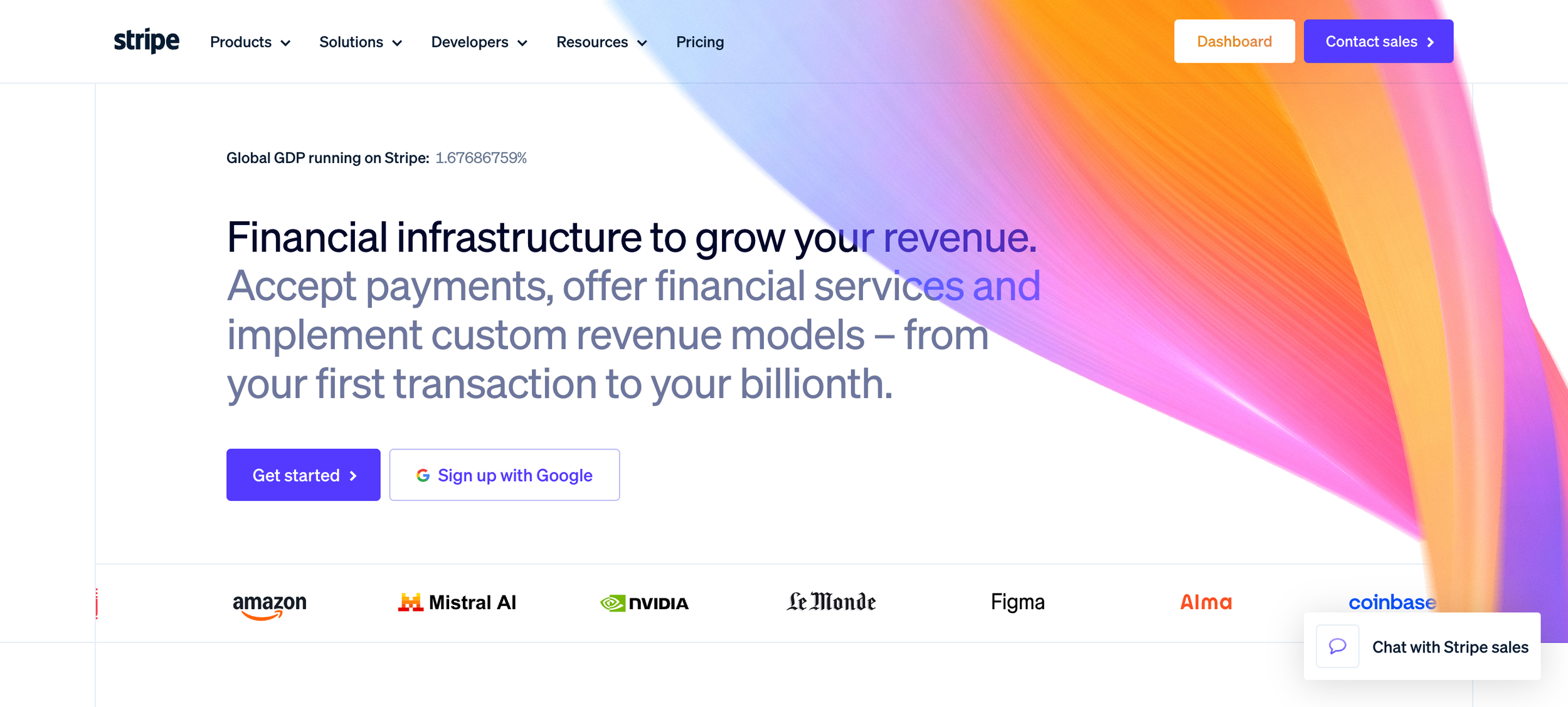
Clarity beats cleverness, and this isn't a matter of taste.
I know. You want to be memorable. You've got a lovely pun rattling around and it's so clever.
But every serious message test and conversion study points the same direction: clear, specific, outcome-led headlines beat clever, vague, metaphor-driven ones almost every time.
Your visitor isn't there to admire your wit. They're there to find out, fast, whether you solve their problem. A pun makes them stop and decode. And decoding costs you the five seconds you didn't have to spare.
The test I use: would a smart twelve-year-old, skimming, understand what you do? If not, simplify.
Here's the difference in practice:
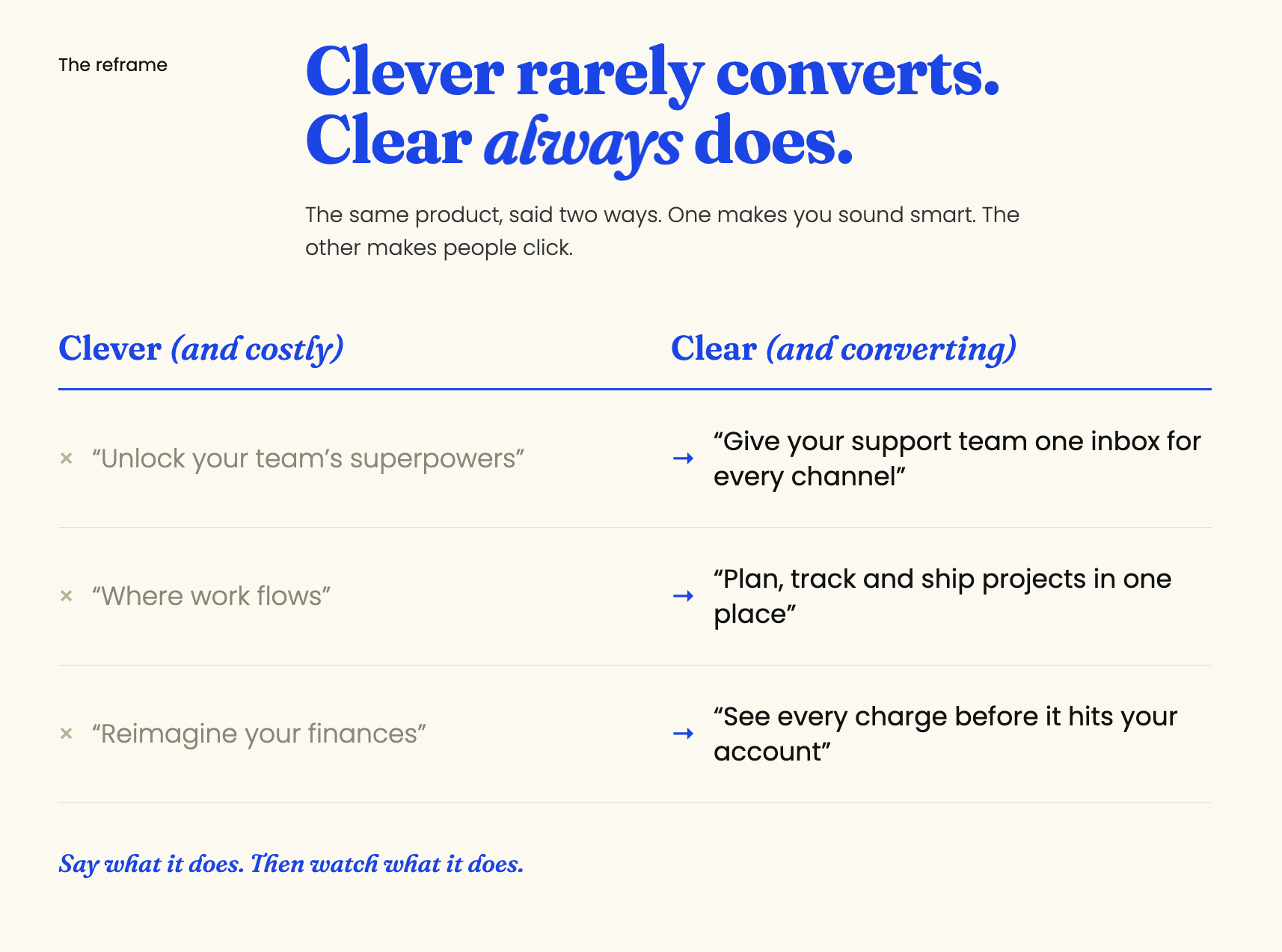
Spot the pattern? The clear versions tell you what it is and what you get without a second's thought. The clever ones make you work, and a working visitor is a leaving visitor.
Headline formulas that reliably earn their keep
The outcome: name the result they want. "Get paid on time, every time."
The value prop + who it's for: "The [category] for [specific people] who need [outcome]."
The problem reframe: state their painful status quo in their own words, then imply the escape.
The "without":[good thing] without [the tradeoff they're bracing for]. "Ship faster without breaking prod." This one's a workhorse, it lands the benefit and pre-empts the objection in a single line.
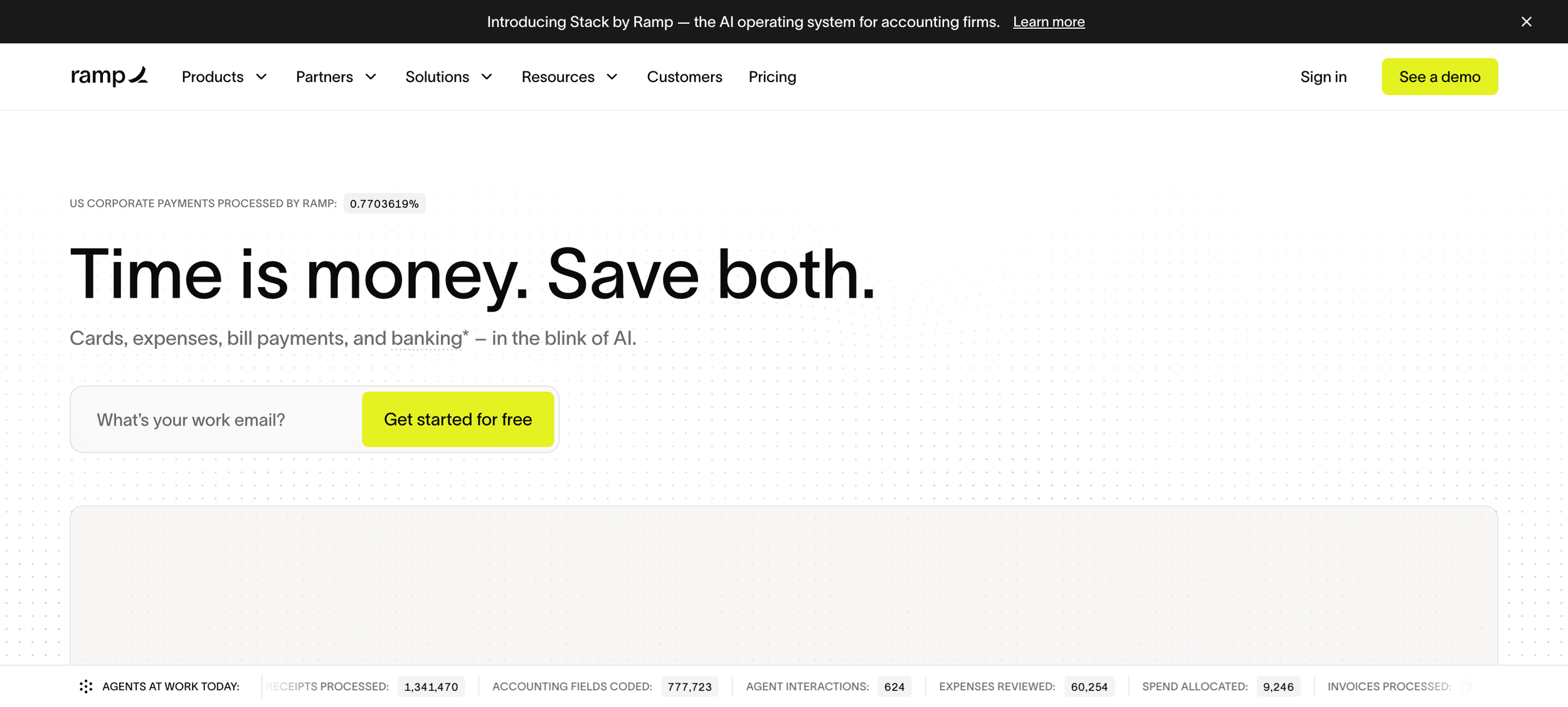
A quick way to pressure-test any headline: the four U's
Borrowed from direct-response copywriting, a strong homepage headline should be:
Useful – does it promise something the reader actually wants?
Ultra-specific – vague is forgettable, specific is believable. "Faster reporting" is weak. "Reports in minutes, not days" lands.
Unique – could a competitor claim the exact same thing? If yes, sharpen it.
Urgent – is there a reason to care now? (This is the gentlest of the four for SaaS, so don't force it, but a live, present pain does the work for you.)
Hit three of the four and you're in good shape. Nail "ultra-specific" and "unique" especially, those two are where most SaaS headlines tend to fall apart.
And the subheadline? Make it earn its place.
Your headline makes the promise. Your subhead makes it believable: it adds the how, the who, or the mechanism. The most common mistake is a subhead that simply restates the headline in slightly different words. Don't echo. Add a layer.
Step 5: Ladder every feature up to an outcome
You already know "sell benefits, not features." Here's the disciplined version, a four-rung ladder:
Feature (what it is) → Function (what it does) → Benefit (what that means for them) → Outcome (what it means for their day, their stress, their standing).
Worked example:
Feature: automated data deduplication.
Function: merges duplicate records across your sources, automatically.
Benefit: you stop manually cleaning lists.
Outcome: your reports are actually trustworthy, and you get your evenings back.
See how much further "get your evenings back" travels than "automated deduplication"?
A few more, translated the same way:
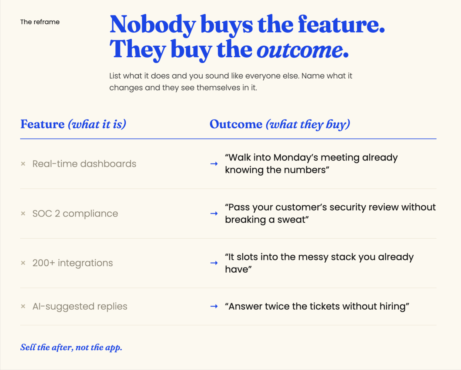
The left column is what your product team is proud of. The right column is what your customer is buying. Put the right column in your headings, and let the left column live in the supporting detail underneath.
Now the nuance that’s easy to miss: know which rung to lead with. A technical, product-aware buyer often wants the feature and function detail and gets twitchy around fluffy outcome-speak. A time-poor economic buyer needs the outcome first. So ladder within each section – outcome-led header, benefit subhead, feature proof beneath – and you'll satisfy the skimmer and the evaluator at the same time.
The quick gut-check for any line you write: ask "so what?" If you can still ask it, you haven't reached the real benefit yet. Keep climbing.
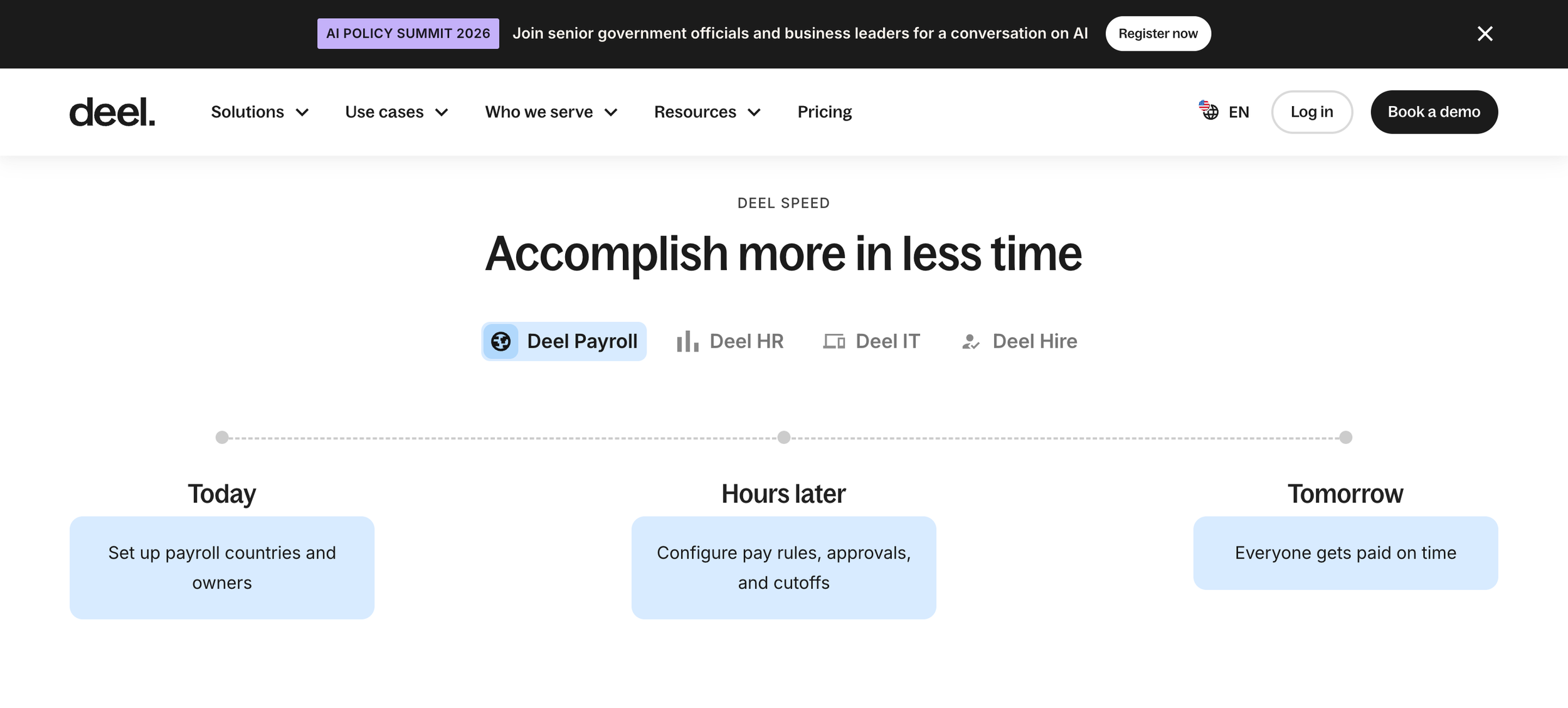
Step 6: Structure the page around your visitor's questions
There's no single perfect template. But there is a reliable logical spine, because it maps to the questions running through your visitor's head, in order. Here's the sequence that works for most B2B SaaS homepages:
Hero – what is this, is it for me, what's in it for me, what do I do next.
Social proof bar – logos or a headline metric, high up, to buy credibility for everything below.
Problem and stakes – name the painful status quo in their language.
How it works – the mechanism, ideally in three simple steps.
Features as benefits – your three to five core capabilities, each laddered to an outcome.
Deeper proof – a results-driven testimonial or mini case study, with a real number in it.
Objection handling – security, integrations, migration, pricing nerves.
Pricing anchor –– especially if you're self-serve.
Final CTA – restate the outcome, one clear action, remove the last scrap of friction.
One important fork in the road: product-led vs sales-led changes the whole page. If people can sign up and self-serve, optimise everything toward "start free," show the product interface (the product is the pitch), and strip out demo friction.
If you're enterprise and sales-led, you're writing for a buying committee: lean harder on logos, security, and ROI proof, and point everything at "book a demo." Know which motion you're running before you touch the structure.
AI-era homepages are now pairing a sharp hero line with a short launch film instead of a static screenshot. If that's on your list, Flowjam makes story-driven launch films for AI startups.
How to write your "how it works" section
Once someone believes your promise, their very next thought is okay, but how does this actually work? Answer it badly and the doubt creeps straight back in.
The winning format is almost always three steps. Not two (feels incomplete), not seven (feels like homework). Three simple, verb-led steps that make the whole product feel effortless:
Connect your data, tools or account.
[The magic bit] – what your product does automatically, on their behalf.
[The payoff] – what they get out the other side.
Two rules. Keep the verbs active and concrete: ✅"Connect," ✅"Import," ✅"Send," not ❌"Onboarding" or ❌"Configuration." And make step three an outcome, not another feature. You're not describing a process; you're showing how easy their better life is to reach.
Step 7: Prove it with specifics, not decoration
Social proof isn't a "nice to have" you sprinkle on at the end. It's a conversion lever. And specificity is the whole game.
Results beat praise. ❌ "Great tool, lovely team" does nothing. ✅ "We cut onboarding from three weeks to four days" does the heavy lifting. Hunt for the number, the before-and-after, the named role.
Attribution builds trust. Full name, role, company, photo. Anonymous quotes read as invented, because half of them are.
Relevant logos beat lots of logos. A few recognisable names your ideal customer would recognise signal "this is for someone like me." A wall of forty logos just signals noise.
Place proof where the claim is. A credibility strip up high, a results testimonial down low near the decision, and micro-proof (a stat, a badge) next to the specific claims it backs up.
Step 8: Handle objections before they're spoken
Every homepage is a quiet negotiation with a sceptic who's looking for a reason to leave. Your job is to answer their objections before they've finished forming them.
Pull your top five objections straight from your sales calls and lost-deal notes (see Step 3 – it all comes back to customer research).
Usually they're some flavour of:
Is this really for a company my size?
Will it work with my stack?
How painful is migration?
Is my data safe?
What's this actually going to cost me?
Then answer each one on the page, before your visitor has to go hunting. And neutralise the biggest fear at the point of decision with a bit of risk reversal – a free trial, "we'll migrate you," "no lock-in," "cancel anytime." Take the risk off their shoulders and watch what happens.
Step 9: Nail the call to action (and stop hedging)
One primary call to action. Repeated. Worded the same way each time.
Please don't give your visitor five competing buttons of equal weight, you'll just split their attention and they'll pick none of them.
✅ One clear primary action ("Start free"), with an optional lower-commitment secondary for the not-quite-ready ("See how it works").
And your button copy? Describe the value or the next step, not the transaction.
✅ "Start my free trial" and "Get my free audit" beat a lonely, joyless ❌ "Submit" every time.
Then reduce the perceived commitment right there at the button – "No card needed," "Takes two minutes."
Don't forget: you're writing for a committee, not a person
Here's a B2B wrinkle that trips up a lot of otherwise-good homepages.
In most SaaS deals of any real size, nobody buys alone. There's a champion who found you and loves you, an economic buyer who signs the cheque and cares about return on investment, and often a technical or security gatekeeper who can veto the whole thing on their own.
Your homepage has to speak to all three without confusing any of them.
In practice, that means layering as you scroll:
For the champion: the outcome and the "finally, something that gets it" emotional hook, right up top.
For the economic buyer: the ROI, the results-with-numbers proof, the business case a little further down.
For the gatekeeper: the security, compliance and integration reassurance that lets them say yes (or at least not say no).
You don't need a separate page for each. You need one page that answers each person's question somewhere in the scroll, in roughly the order it'll be asked. Miss one (especially the gatekeeper) and a deal your champion adores can die in a meeting you never get to see.
Treat your homepage copy as a hypothesis, not a monument
Here's a mindset shift that'll save you a lot of ego and a lot of money: nobody knows the best homepage copy. Not me, not you, not the agency charging you forty grand. You discover it.
So ship a strong version – one built on real positioning and real customer research – and then treat your hero and value proposition as your leading hypothesis.
Test them. Message-test with real target customers before launch if you can; A/B test the headline once you're live.
Your homepage is the highest-leverage copy you own. It deserves to be tested, not just admired.
Your SaaS homepage copy checklist
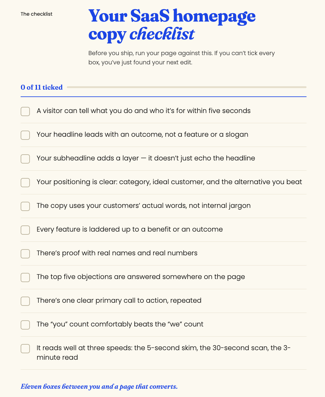
Before you ship, run your page against this. If you can't tick every box, you've just found your next edit:
A visitor can tell what you do and who it's for within five seconds
Your headline leads with an outcome, not a feature or a slogan
Your subheadline adds a layer, it doesn't just echo the headline
Your positioning is clear: category, ideal customer, and the alternative you beat
The copy uses your customers' actual words, not internal jargon
Every feature is laddered up to a benefit or an outcome
There's proof with real names and real numbers
The top five objections are answered somewhere on the page
There's one clear primary call to action, repeated
The "you" count comfortably beats the "we" count
It reads well at three speeds: the 5-second skim, the 30-second scan, the 3-minute read
Print it. Stick it above your desk. Thank me later.
Your homepage is working 24/7. Make sure it's working for you.
Your homepage never sleeps. Right now, while you're reading this, it's out there having silent conversations with strangers, either winning them over or quietly losing them. Every visitor is a chance to build trust, show value, and earn the click.
But that only happens when the words underneath are doing their job: clear positioning, your customers' real language, a hero that lands in five seconds, and a structure that answers every question in the right order.
That's the work I do. I listen, I observe, I learn, and I iterate, then I hand you a homepage that sounds unmistakably like you and works a great deal harder than a bit of clever wordplay ever could.
If you've realised that writing your own homepage copy is a bit like cutting your own hair technically possible, but probably best left to someone with the right training) let's chat.
Get in touch and let's make your words work as hard as your product does.
Frequently asked questions about SaaS homepage copy
How long should SaaS homepage copy be?
Long enough to answer every question a visitor needs answered before deciding, and not a word longer. In practice, most effective SaaS homepages are fairly long-scrolling pages – hero, proof, problem, solution, features, deeper proof, objections, CTA – but each section is tight. Length isn't the enemy. Padding is.
What is the most important part of a SaaS homepage?
The hero section: your headline, subheadline, and primary call to action. It's the first thing every visitor sees and does roughly 80% of the persuading. If your hero fails the five-second test (what is this, is it for me, why care), most visitors never scroll far enough to see the rest.
How do I write a SaaS homepage headline?
Lead with the outcome your customer wants, in their own words, stated plainly. Favour clarity over cleverness, name who it's for, and consider the "[outcome] without [the usual tradeoff]" formula to hit benefit and objection in one line. Then test it, the headline is worth testing above everything else.
Should I hire a copywriter for my SaaS homepage?
If your positioning is muddy, your homepage sounds like every competitor, or you're too close to the product to see it clearly, yes. A good SaaS copywriter's real value isn't the sentences; it's the positioning and customer research underneath them, which is exactly the part AI tools and internal teams tend to skip.
What's the difference between features and benefits on a homepage?
A feature is what your product is or does (automated reporting). A benefit is what that means for the customer (you stop building reports by hand and get your time back). Homepages that list features tell visitors about the product; homepages that translate features into benefits and outcomes tell visitors about their better life. The second one converts.
How many words should a SaaS hero headline be?
Short, usually between six and twelve words. Long enough to say something specific, short enough to grasp in a single glance. If your headline runs past a dozen words, you're probably trying to make it do the subheadline's job. Split it: a punchy promise in the headline, the detail in the subhead.
What should go above the fold on a SaaS homepage?
Four things: a clear headline stating what you do and for whom, a subheadline adding specificity or proof, one primary call to action, and a supporting visual (ideally the product itself). That's it. Above the fold answers "what is this and is it for me?" — everything else earns its place further down the page.
How often should I update my SaaS homepage copy?
Revisit it whenever your positioning, pricing, ideal customer or product materially changes, and review it at least once a year regardless. Your homepage is a living hypothesis, not a monument. If your conversion rate slips or your best customers have quietly shifted, that's your cue to test fresh messaging.
How do I make my SaaS homepage stand out from competitors?
Get specific where they're generic. Most competitors hide behind "powerful, seamless, all-in-one" language, so plain, concrete, outcome-led copy built from real customer words instantly reads as more trustworthy and more human. Sharp positioning plus your customers' actual words is the whole edge, and it happens to be the exact part AI-generated copy can't fake.